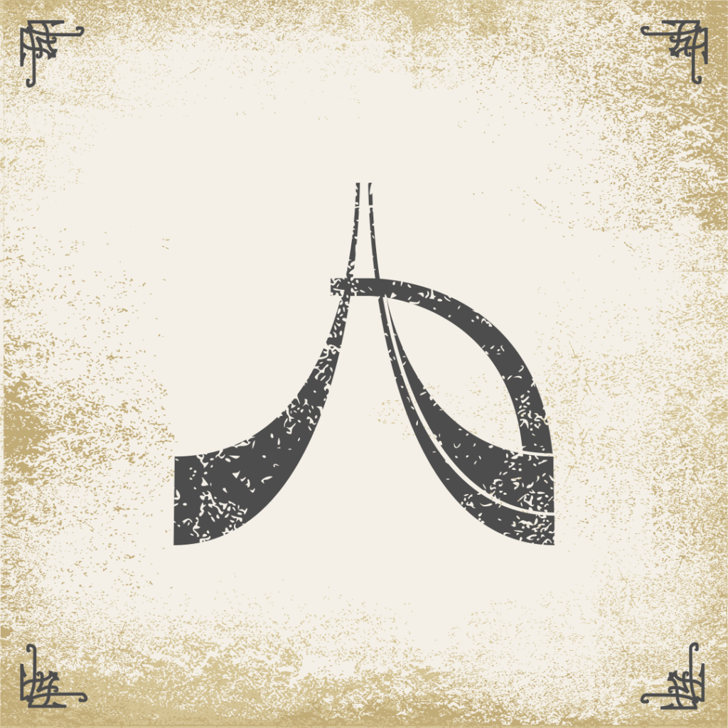
Over the last couple of weeks, I’ve been experimenting with some different looks for the design and layout of the card fronts. One thing that I started experimenting with were grunge textures in Inkscape to get a bit of a weathered and organic paper look. When applied to other symbols, I also found that grunge textures also gave them a more rugged and realistic appearance which in contrast with some more elegant embellishments in the corners gave a look that I was pleased with. This image is a result of some of that experimentation using the Antibyss logo as the subject symbol. I’ll be continuing to experiment as the visuals around the theming for Project Aleutian really start to take shape.
